The Beatles album covers ranked from least to most favorite
/Thirteen - Please Please Me. At dead last, lucky number 13, we have Please Please Me. I feel like the colors clash, it makes all of the beatles look goofy, and it seems like they were going for what I imagine a the british photographer referred to as "cheeky" but I'm just not a fan.
Twelve - Yellow Submarine. It's basically the movie cover. I love the movie and the artwork, but it looks like they just took a shot from the movie and copy/pasted (or however they did it back in the sixties) the submarine and an extra shot of the disembodied torsos of their Sergeant Pepper's Lonely Hearts Club Band alter egos.
Eleven - Magical Mystery Tour. I feel like this is a little too much of a hodgepodge. This is what I think of as the opposite of timeless design. But they didn't know that then! How could they? They were so forward thinking for their era, I guess I just expect more from them.
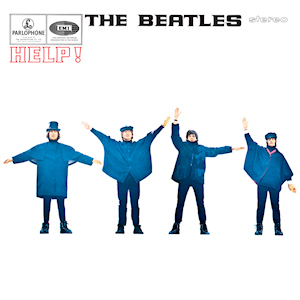
Ten - Help!. Here we go, getting to the more stripped down design style with a lot of white space. It's a good cover. It was a little hard to put it this low, but I think I have been a stern but fair ruler in my judgments.
Nine - Let It Be. Solid. Exactly where a pick in the middle of the pack should be. I like the framing and the pictures and I even have a pint glass with this album art on it. Cheers!
Eight - Sgt. Pepper's Lonely Hearts Club Band. I think this is where I might diverge from most people's opinions. I think that this is certainly one of the more iconic covers from The Beatles. Heck, perhaps in all of music. I even find a certain appeal in the over saturated, garish colors, still I find myself enjoying some of the simpler album covers even more.
Seven - The Beatles. Also known as The White Album, because the cover is just a big empty white space. The original cover had "The BEATLES" embossed on it. Later pressings has the title printed in a light grey. I don't know why I am so drawn to it, I just like the letters kind of lost in all that white space. I find it very appealing, and I think they are one of the first to have more or less a blank cover. I have no idea what their thought process was, but I think the simple-in-the-extreme cover serves as a great counterpoint to what might be considered a somewhat excessive double album.
Six - Rubber Soul. One of my favorite albums ever. I really like the photo, with the slightly green filter over it... the style of the text marks it as a child of the sixties however. I love how this contrasts with the next one on my list. Note the order of the lads from left to right.
Five - Beatles for Sale. First let me say I love this photo, everything about it. Now back to what I started to say before! Compare with Rubber Soul. I feel like this early Beatles album cover photo is a perfect contrast with the Beatles of just ONE year ago. Beatles for Sale and Rubber Soul were released within a two year period, a period in which they released FIVE studio albums. IN. TWO. YEARS. It's no wonder they go from a moody, windswept look on the cover of Beatles for Sale, to literally a stretched, skewed, warped version of themselves in a remarkably similar arrangement (albeit tilted about forty-five degrees). I can't believe I never noticed the similarities between the two covers before, but it is striking, no? I want to believe it was purposeful. I MUST believe.
Four - Revolver. A great, iconic cover. I love the line drawings and all the jumble of stuff in between them. The cover, as the music inside, presage a band that is transitioning from pop icons into some truly new, weird territory.
Three - A Hard Day's Night. I love the striking combo of blue, red, black, and white used here. The repeated pictures in slightly different poses, alternating between serious and silly.
Two - With the Beatles. This is a simple, iconic cover. Innovative in its time and now perhaps in the realm of cliche. Any band would have a hard time pulling off such a pretentious photo but it works because they are the Beatles and they earned it.
One - Abbey Road. I don't have a lot to say about this except that it is one of the most imitated and parodied album covers ever, for good reason. A perfectly composed shot of a band on the brink of dissolution, at the height of their powers, just walking across a street. It has to be one of the best album covers of all time.


